Murray Taylor looks at the Ambrosia, Versal and Asian fonts, a method of carving handwriting and some interesting finds from car boot sales
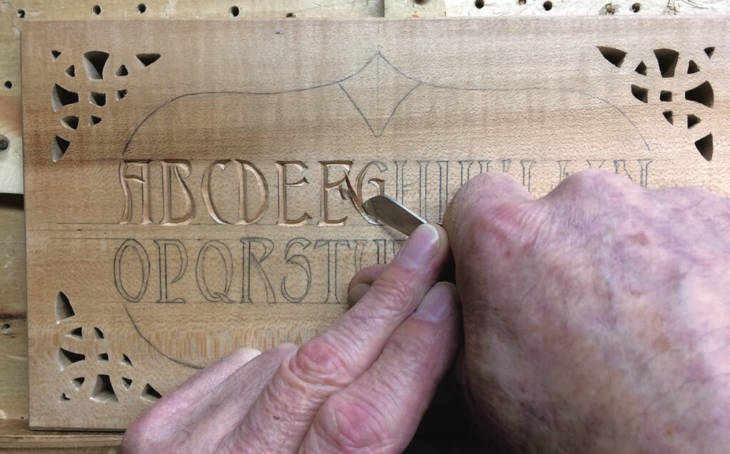
We are going to look the Ambrosia font, which can be found on many websites. This version, however, is one I have adapted from the master – I refer, of course, to Wayne Barton, who inspired me in my venture into chip carving. This font lends itself to chip carving or to larger letters in harder woods using conventional gouges and chisels.
The Ambrosia font
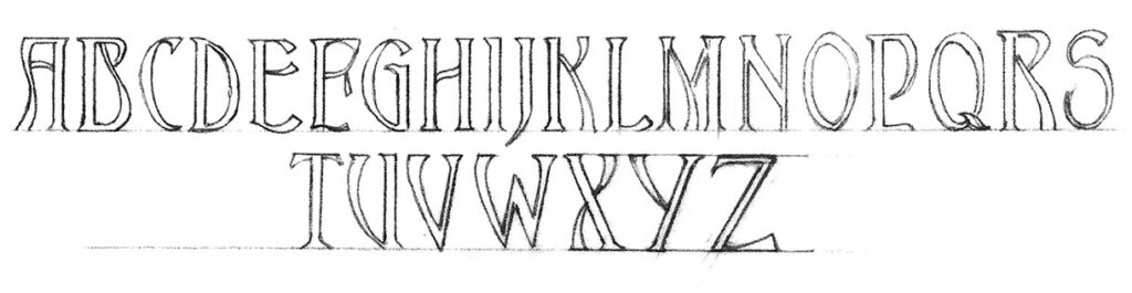
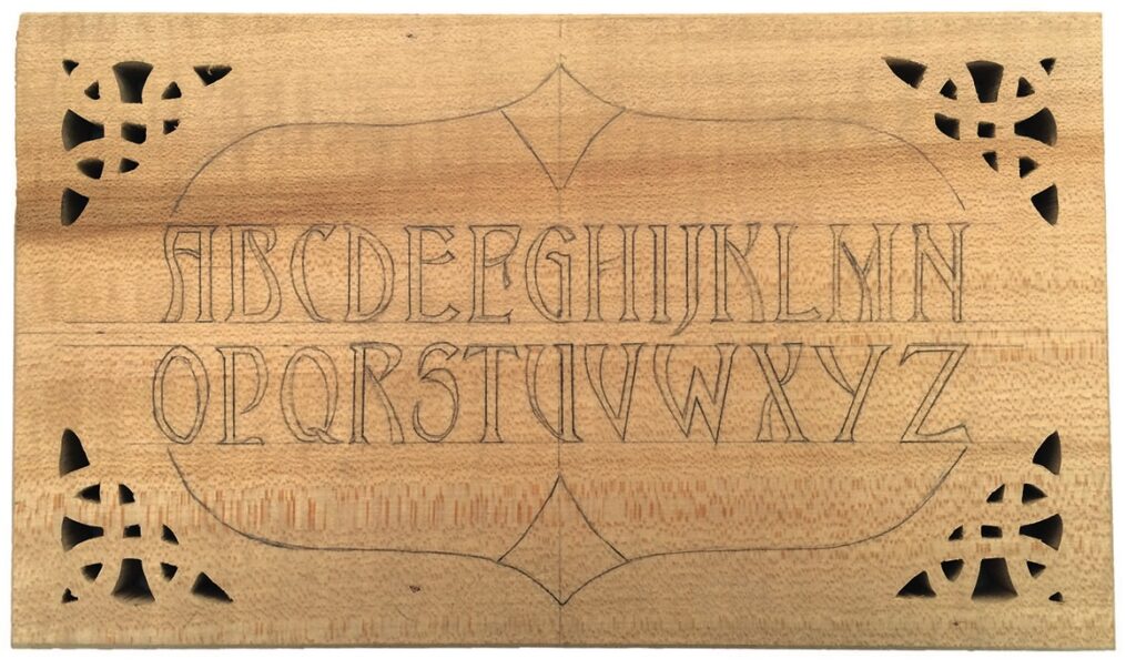
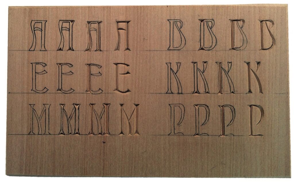
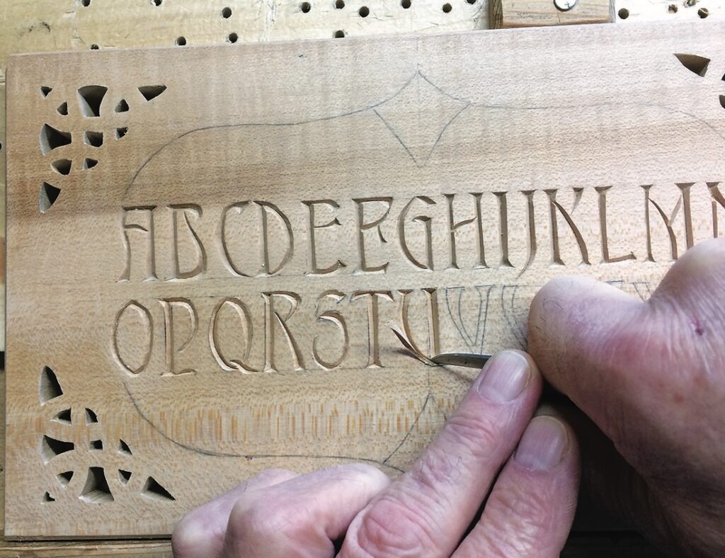
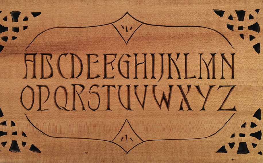
Ambrosia is an adaptable font
Carving the Ambrosia font should not cause you any problems as the letters are mostly formed from connected chips. I have selected a few letters to show you the development of carving them.
This font lends itself to many uses. It is very decorative and is especially useful when you have limited space as the letters can be drawn quite close together without unduly distorting the words or distracting from the artistic appeal. In the project idea you will see how the ‘D’ and the ‘A’ sit so well together in the days of the week.
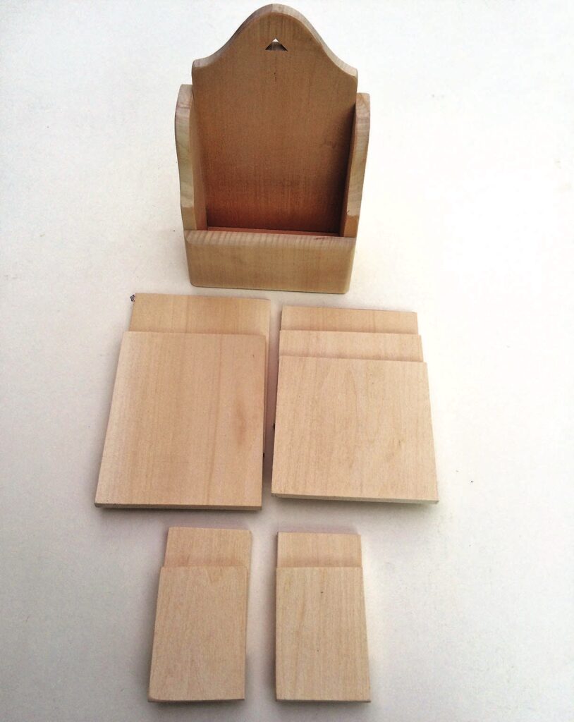
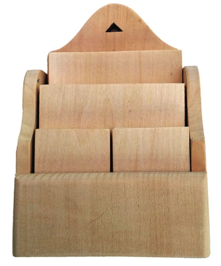
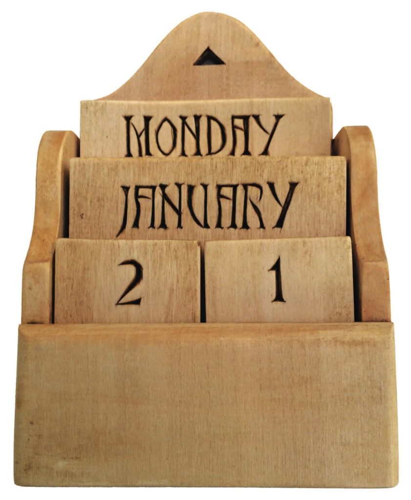
This now leads me to the project, which as always is meant to give you food for thought – you don’t have to adhere rigidly to my design. The exercise here is to produce a perpetual calendar using a very simple construction method. It consists of a series of different-size plaques and a holding box.
You could copy the design of the box I have made or design one of your own. There are few rules, but you do need to make four small plaques, three middle sized and two large ones. For this exercise I have used 6mm-thick material for the plaques which measure as follows: four off 50 x 70mm, three off 100 x 100mm and two off 100 x 130mm.
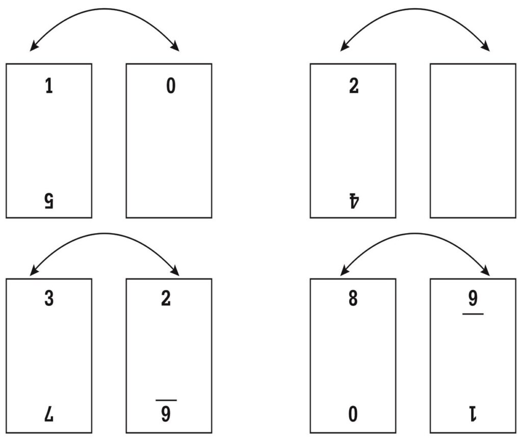
In order to be able to form any number from 1 to 31 you will need to duplicate some numbers and blanks as shown in the diagram. The days of the week go on to each end of longer plaques and on both sides, while the months are on the middle ones. The box is a simple pinned and glued construction, made to give about a 1mm gap all round the plaques to allow for easy removal. You could, of course, make a much more technical construction and alter the dimensions to suit your requirements, but the general idea should be fairly obvious and the example I have made can be freestanding or hanging.
CARVER’S NOTE:
Draw out the days and months on tracing paper and copy on to the plaques using graphite paper. Remember to work from a centreline.
The Versal font
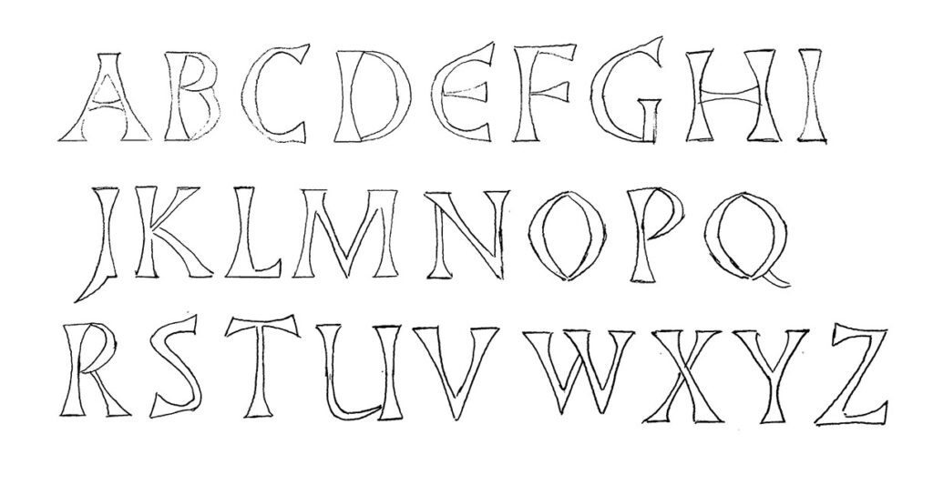
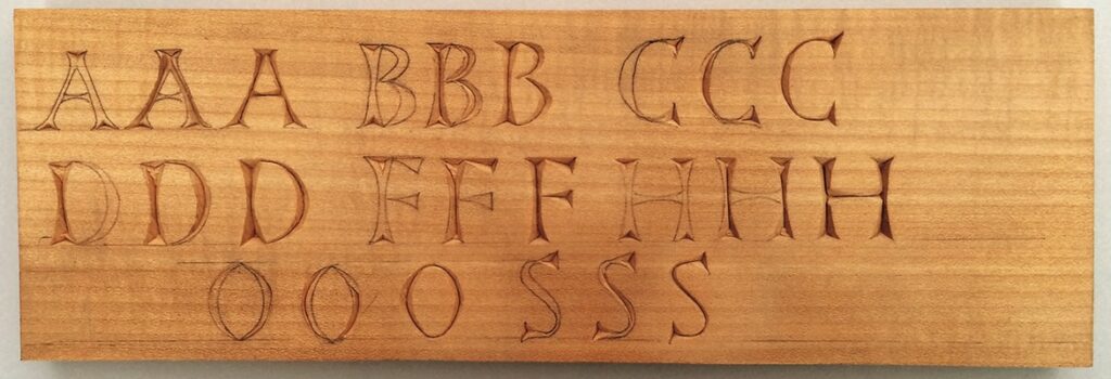
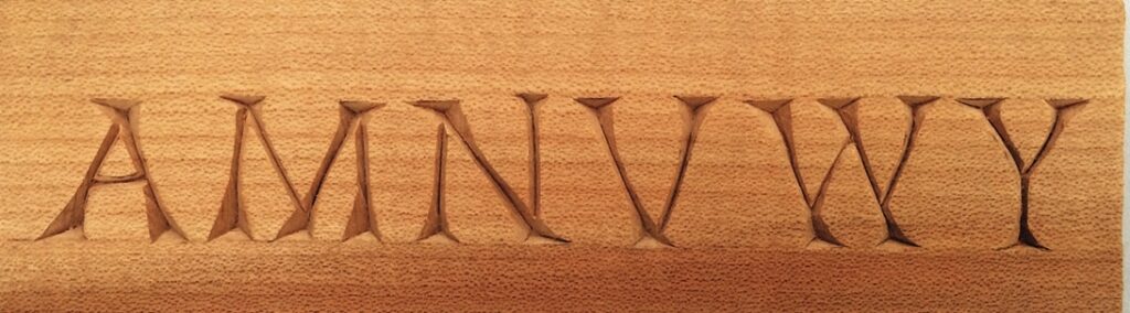
The next font I want to look at is called Versal. It is a variation of the standard Roman font in which the straight-sided letters become concave, which makes it very decorative and, in my opinion, much easier to carve. There is a further advantage in that the ‘O’ and ‘Q’, which seem to cause problems in the standard font, are formed by joining two crescent-shaped chips. You can play around with the serifs of this font and make them quite a bit over-sized, which gives a pleasing result.
The letters in this font fall into natural categories, the ones with straight and curved elements such as ‘B’, ‘D’, ‘G’, ‘P’, ‘R’ and ‘U’, the straight line letters, and those with all curves, ‘O’, ‘Q’ and ‘S’. The ‘D’, for example, can be carved as the upright section with the curved section being treated as a simple two-cut crescent chip barley touching the upright, or it can be run on to the upright and form a more professional-looking letter.

CARVER’S NOTE:
It can sometimes be difficult to copy very small letters, so draw out the required words at a much larger scale, then reduce them in a photocopier.
Looking to the East
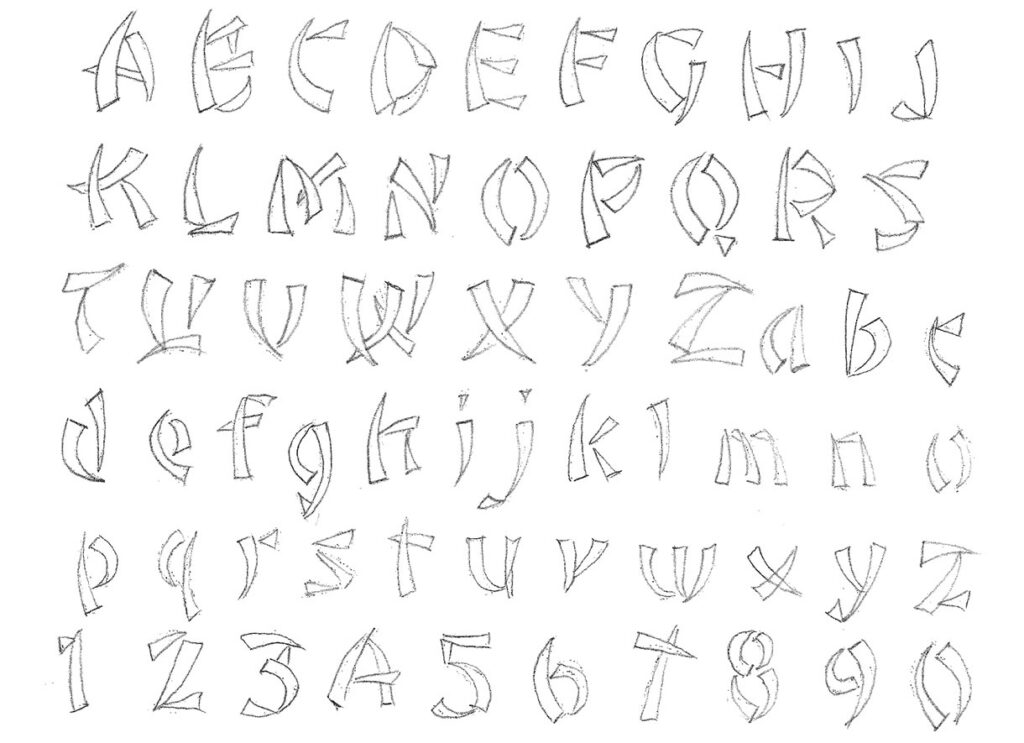
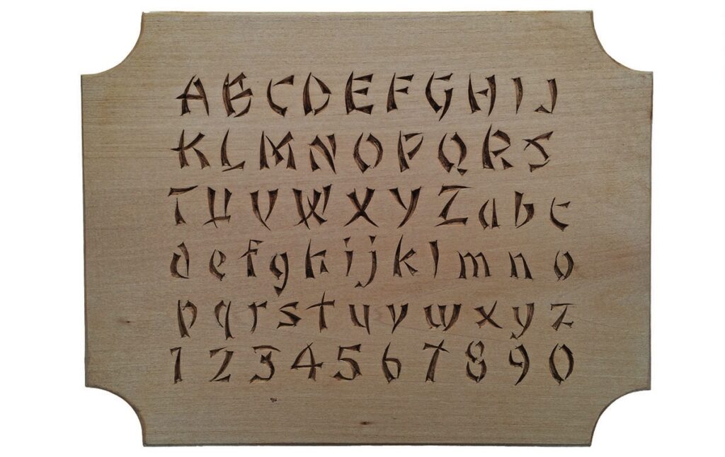
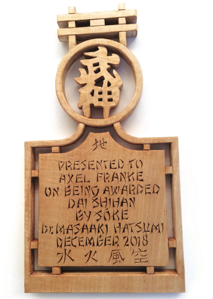
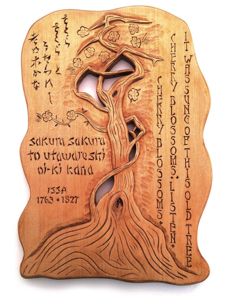
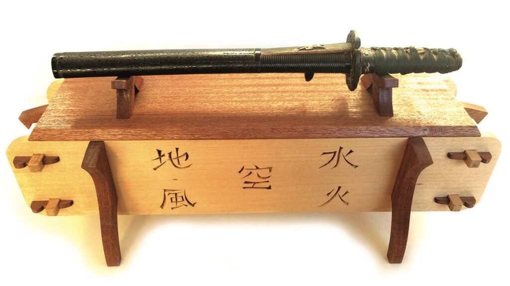
The next font is a more oriental style, which I find very useful for objects of a Japanese nature and for inscriptions on martial arts trophies. It consists of very simple three-cut chips and can be adapted and varied according to needs.
Unlike more formal fonts, which need to be copied accurately in order not to lose the form, this font can be modified without losing the integrity of the letters, which generally makes it much easier and quicker to carve.
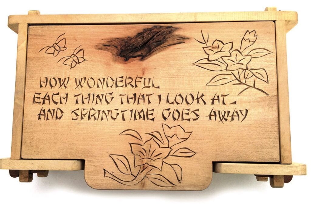
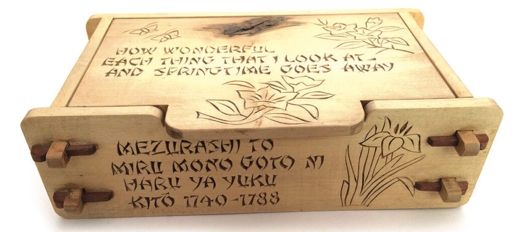
I made the Haiku Box to hold the tools and oils, powders etc. used in the cleaning of antique Japanese swords. I realise that the words of the haiku are a little confusing when translated, but their significance is not important here – I am showing it to illustrate the use of the font and the chip-carved Japanese motifs.
It is worth noting the use of the wood with a natural knot and the simple construction method I have employed in making the box. It consists of simple mortises on the front and back panels with extended tenons on the sides, all held together with simple pegs. The sides and lid of the box are made of lime. The construction of this box can be achieved with a scrollsaw or a hand held fret saw. You could use the idea for any carving design of your own and, of course, the box could contain anything you wish.
An explanatory note:
The haiku is a form of Japanese poetry in three lines, made up of five, seven and five syllables. The lines do not necessarily rhyme as we might expect, but it is more to do with the meaning. The English translation, however, does not conform to this format.
Carving handwriting
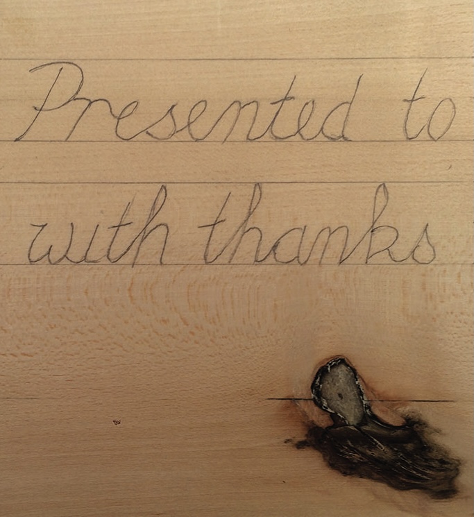
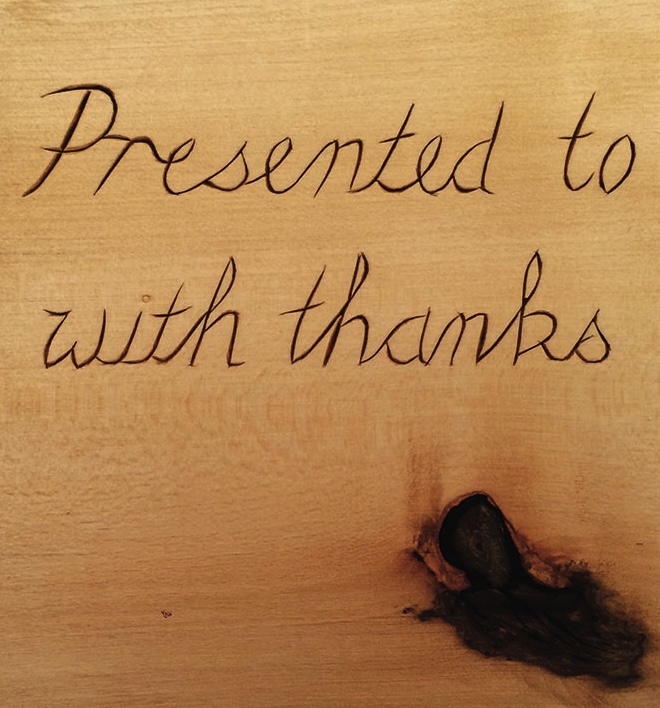
During my working life as a jeweller and silversmith I was often asked to engrave an inscription on various silver objects. They would usually be of a fairly formal format, but there was a style that became popular as it really personalised the sentiment behind the words. The donor would write the words in their own handwriting and we would copy this in miniature. The tools we used were not that different from the chisels and gouges that carvers use for wood; just a lot smaller, called scorpers or gravers. I thought this idea would be useful to personalise wooden items, so I have just written some words on a piece of lime and then simply chip carved the lines.
A NOTE ABOUT THE BOX:
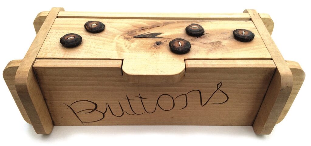
The box was simply made with four cross-halving joints and two screws for a hinge. It was constructed just using a fretsaw and could be the basis for many project ideas.
Foreign alphabets
Found treasures
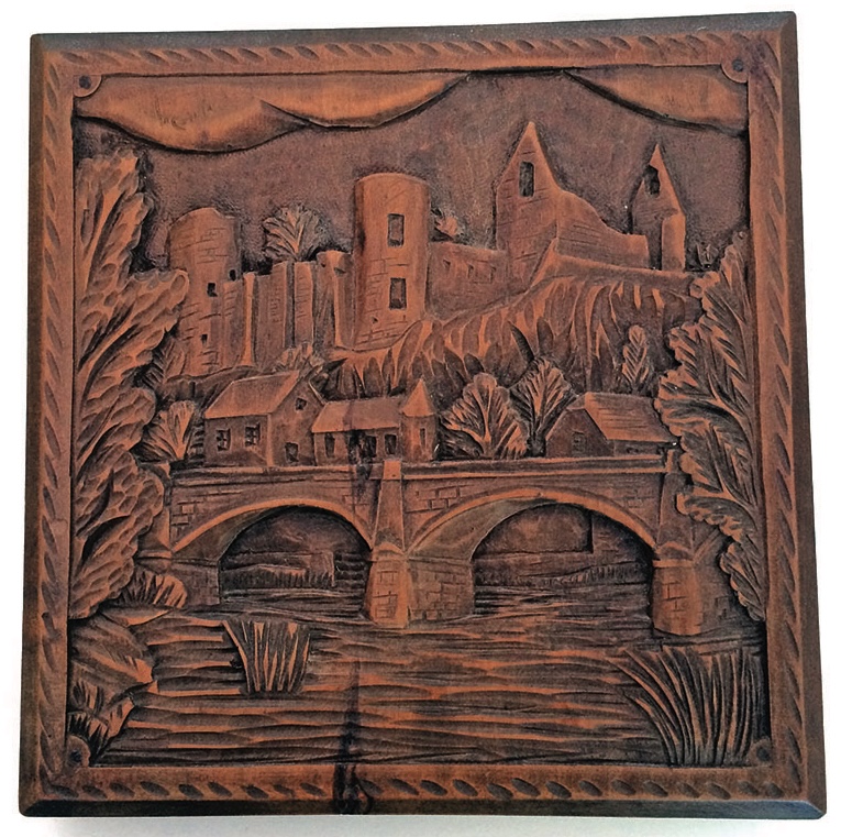
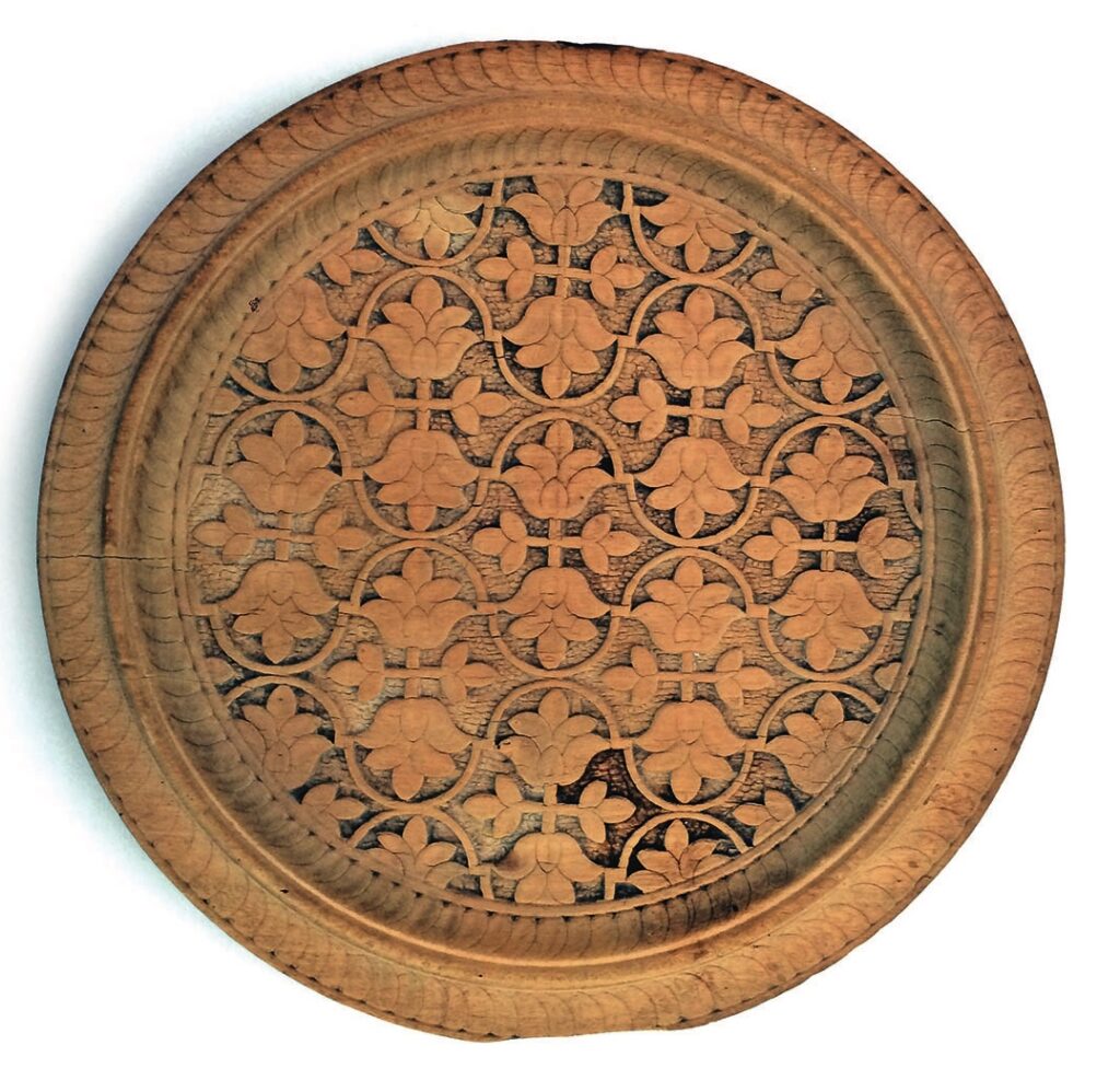
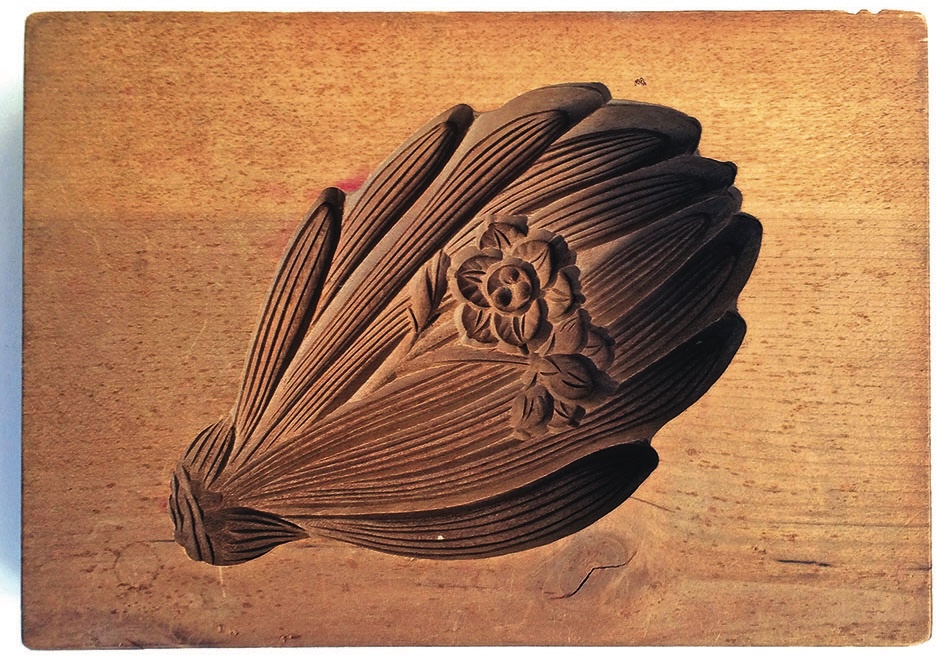
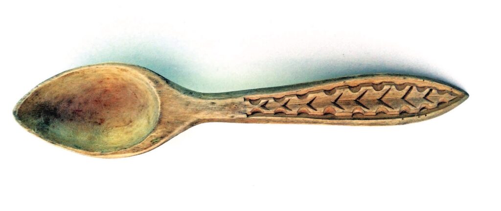
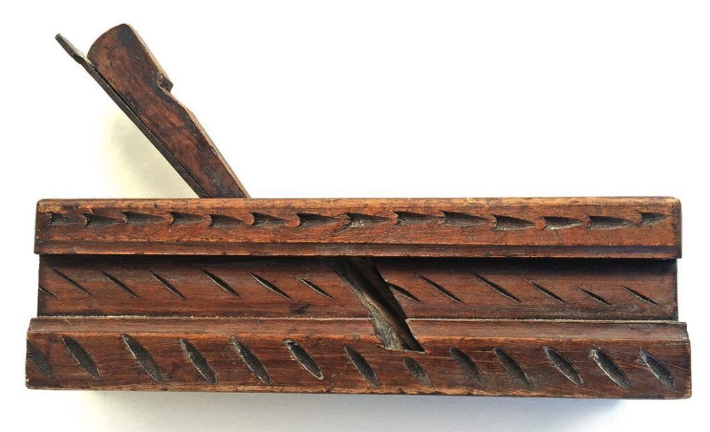
Readers who have contacted me about my articles have referred to the fact that they like the photographs I take when out and about as a source of ideas. You could expand on this by looking for inexpensive carved items at car boots and bric-a-brac shops. Here are a few examples.
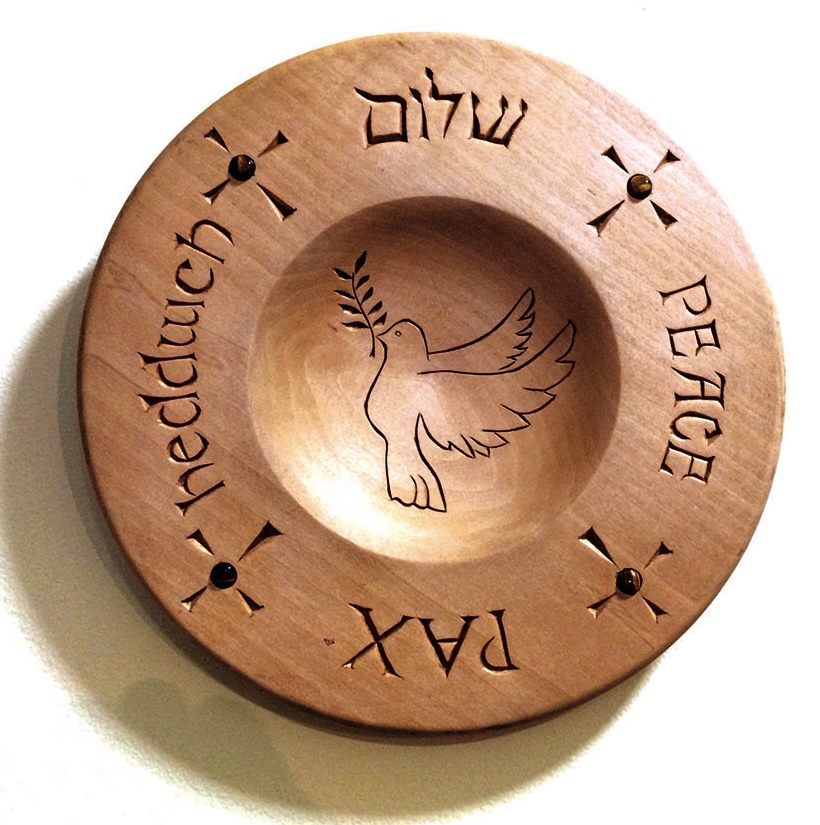
Sometimes you may wish to carve foreign alphabets on a special project. Having covered various fonts in detail in previous articles you should by now be able to overcome the problems involved in unusual fonts, the tools required, and the difficulties incurred. The photographs show examples of two foreign fonts.
I hope these pieces encourage you to keep a look-out for interesting carvings. I find them very inspirational, my students get lots of ideas from them and, of course, they make an attractive collection – or so I am trying to convince my wife.
And so, with apologies to the Japanese poets of old, here is my usual mantra in five, seven and five syllables:
‘Carve comfortably, Keep sharp and never tired. Only practice brings perfection.’