The Diary of a Student Woodcarver:
In this installment of the Diary of a Student Woodcarver, William Barsley looks at letter carving and his first year of the course as it comes to an end.
In this installment of the Diary of a Student Woodcarver, William Barsley looks at letter carving and his first year of the course as it comes to an end
End of the first year. I can’t quite believe that the first year of the course is almost up. Luckily there are still two more years to go, but the speed at which this first year has flown by has made me value each day even more. Now feels like a good time to reflect on the year and whether it was the right decision for me to pursue this ‘official’ route of training. Doing a diploma is by no means the only way to become a professional woodcarver (one of the best tutors at college is a self taught carver), but I feel that the structure and guidance offered by a course suits my way of learning. It’s motivating to see the improvement in my work and that of my classmates since we started back in October.
The degree show of the current final-year students is fast approaching, during which they present and have the opportunity to sell the work they have completed throughout the course. The workshops have been spruced up, old woodchips cleared out and the culmination of their three years of hard work is carefully displayed around the studios. I highly recommend coming along if you’re in the area at the right time. The degree show takes place annually in June and there are usually a number of days open to the public.
Letter carving
In this series I have touched upon some of the key techniques we have been learning on the course, such as relief carving, drawing and modelling. But I have not yet discussed the practice of letter carving, which a good part of the course focuses on. Lettering can be one of many strings to a woodcarver’s bow, with clients often wanting inscriptions or lettering included in their commissions, or, for some, can be a full-time practice.
Learning to letter carve has been a revelation to me as I never quite realised the depth and intricacy involved, nor the concentration required. We look at letters every day but rarely do we stop to think about their form and structure, and even more rarely do we notice the space between the words and letters (although this in itself can be a sign of good lettering).
Our tutor, Mark Frith, who attended the City & Guilds of London Art School in 1980, is a renowned letter carver, working in both wood and stone from his London workshop. In partnership with Sally Bower, one of Mark’s most notable works to date is the Language Pillar at the Tibetan Peace Garden next to the Imperial War Museum in London. This impressive piece features some of the Dalai Lama’s words carved in four different languages.
The grammar of lettering
Mark is teaching us what is often described as the ‘grammar of lettering’. Using the analogy of learning to drive a car, for example, you must know the function and importance of the gear stick and clutch before learning how to use them. With lettering, you must know the function and importance of key components, such as the thicks and thins of a letter and the spaces between them, before being able to fully understand the construct of different scripts to apply the form and composition.
Starting with the basics in our first year we focused on learning capital letters, in particular those found on the famous Trajan column in Rome, which are considered the most important historical example.
In our second year, through a study of calligraphy, we will learn ‘round hand’ lower case and how to develop further scripts. We will carve a lower case inscription during this time. In the final year, we will be given the freedom and creativity to work on a lettering project of our choice.
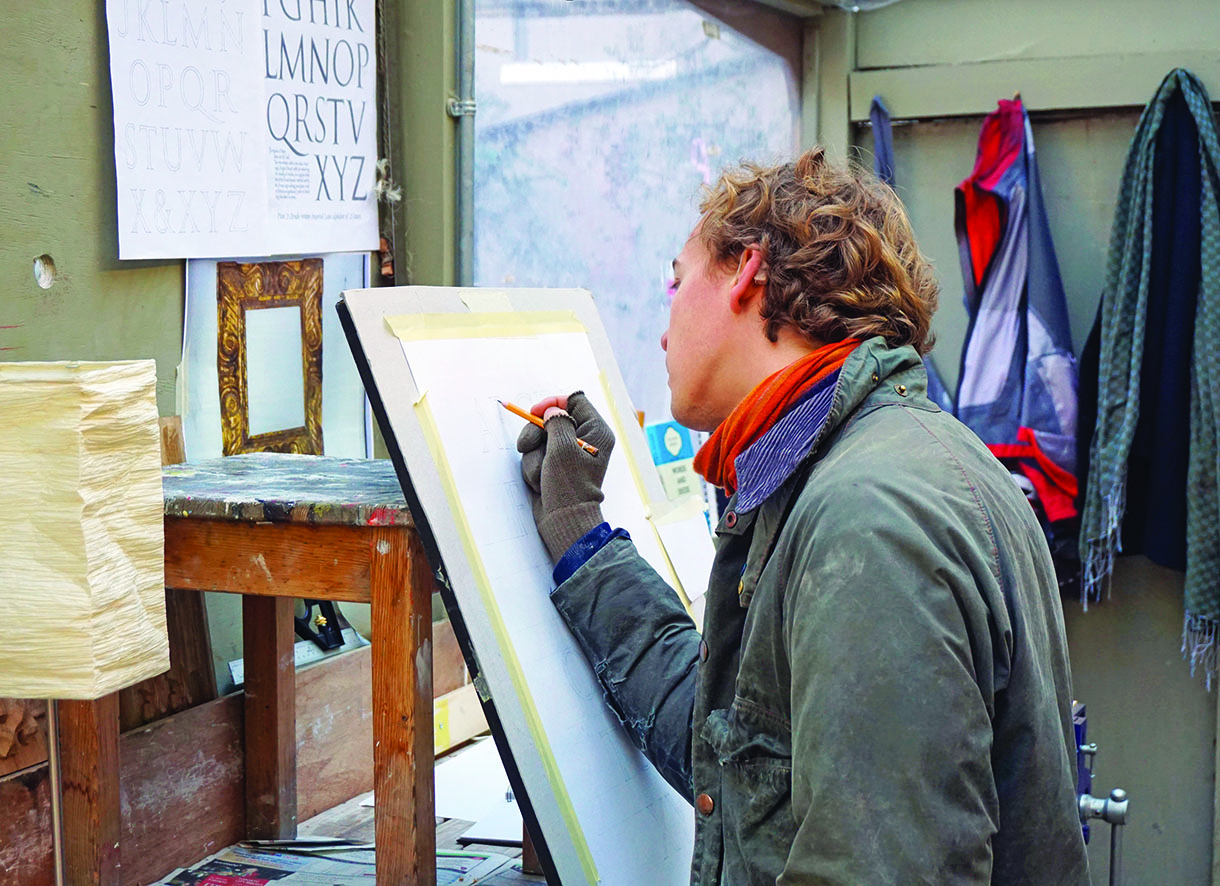
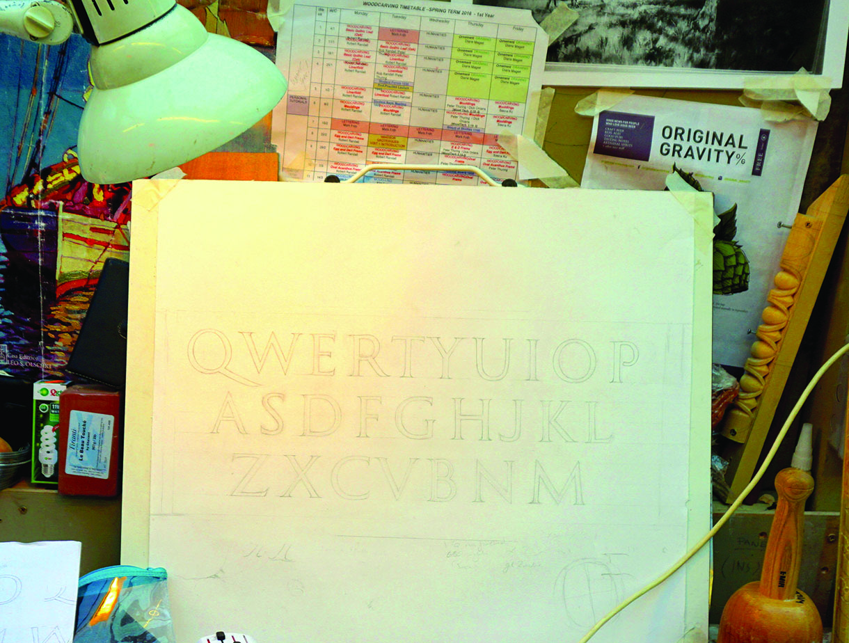
Drawing out the letters in preparation
Carving the alphabet
To put into practice what we learned during this first year, our initial lettering project was to design and carve the alphabet in capital letters. The letterform had to be Trajan but the layout and design could be our own creation. I decided to use the modern QWERTY computer keyboard layout for my design, which made an interesting juxtaposition against the traditional art of letter carving and the natural grains of the wood.
To ensure we understood the variation and influence that different types of wood can have on our lettering, each of us were encouraged to carve our alphabet in a different wood. The choices were cherry, oak, maple, sycamore and beech – all good woods for lettering. I chose oak for my project.
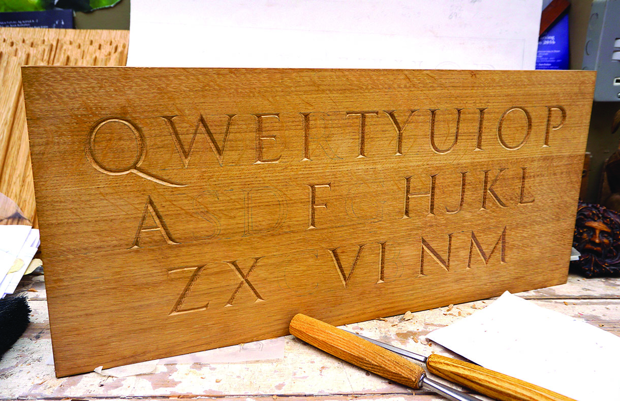
Finished design for the alphabet
Halfway through carving the alphabet
Did you know?
Historically, lettering was painted on with a brush prior to the carver cutting in the letters. This is thought to be where serifs come from (where the brush stroke would start) as Edward Catich describes in his book The Origin of the Serif.
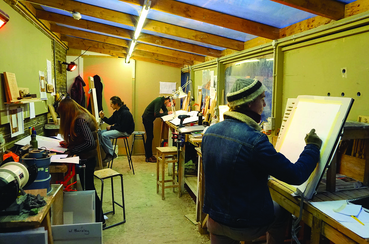
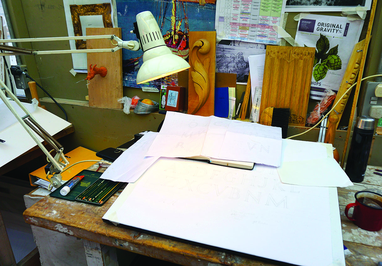
My fellow first years, busy designing their alphabets
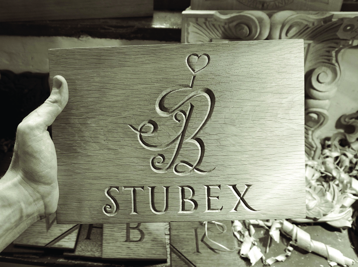
My first lettering commission for a house sign, received soon after the alphabet project
Once our designs were complete and our planks were jointed together and finely sanded, we carefully transferred the drawing on to the wood using carbon copy transfer paper. Over the course of a week, we tentatively began carving – slowly at first, nervous about slipping or spoiling the piece, but faster by the end and with increasing confidence (an important part of carving). It was with relief that I finished the project without any major slip-ups though, as every carver knows, there are always minor mistakes that only they are likely to ever notice but that can be irritating at the time.
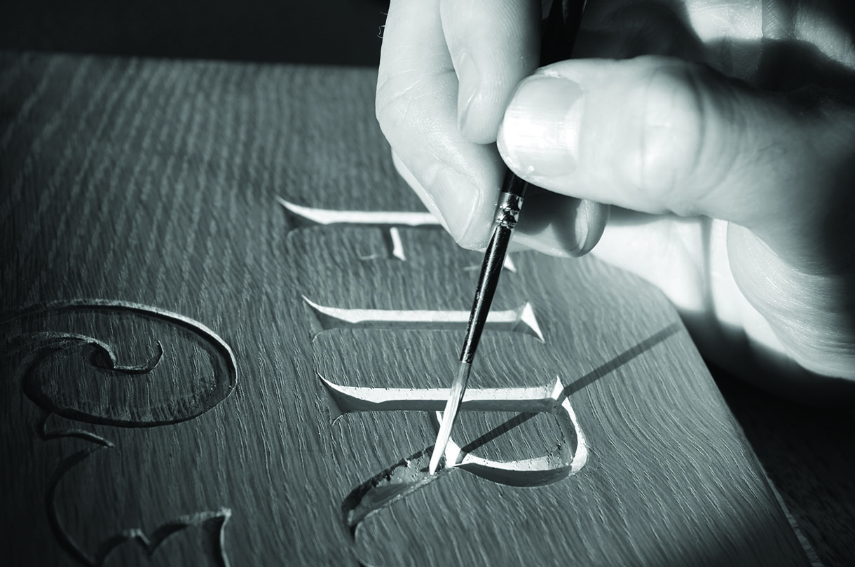
Painted lettering for a house sign in Kent, carved in oak
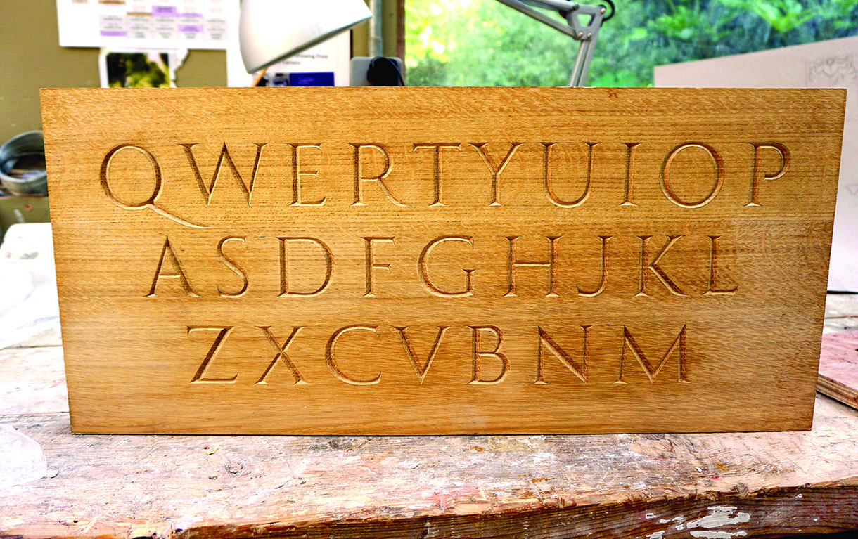
The completed alphabet project
Top tips for lettering
• Make sure the direction of the wood grain is running horizontal to your lettering. This makes the letters easier to carve and they don’t split out as much.
• When carving letters into oak, the shadow is often lost. One trick is to carve them just a little deeper to trap the shadow, aiming for more of a 90° angle.
• One lesson I learned the hard way: make sure you sand the board prior to carving and not after. This will save you from dulling the edges of your lettering.


